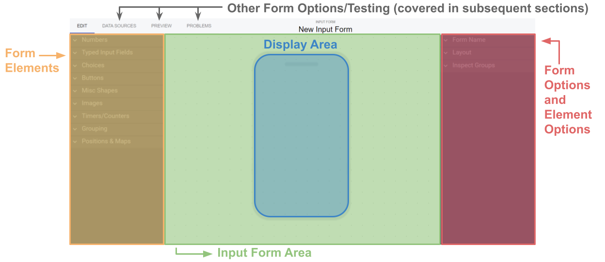
Overview and Tour
Changing the form Name and Description
If you look on the left you'll see some dropdowns that look like this:
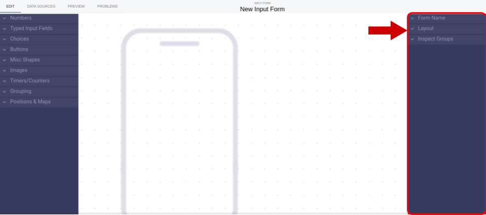
We call these buckets. Go ahead and click on the bucket that says Form Name
Here you can change the name and description of your form. Go ahead and give it a try, name this form
"test form" and give it a description: "A form to test the RLD platform". Once you've done this You should
see that the name at the top of the screen has changed.
Layout
RLD can be used to create apps for any device. Here you will see 5 form factors listed:
- Phone Vertical
- Tablet Vertical
- Phone Horizontal
- Tablet Horizontal
- Computer
If you select a form factor other than a phone you will see the icon in the middle of the screen change.
NOTE The majority of the RLD wiki will use a phone application for examples. The process, however, is the same
for any layout.
What can I do Here?
Here you can:
- Drag in elements from the left sidebar know as the Form Elements sidebar
- Edit the Form attributes such as layout, background color, and name.
- Edit the form elements
- Defaults
- Border colors
- Element Layouts
- Options for radios and dropdowns
- How certain tabs and popups appears
- Preview your form
- See issues in your form
Form Elements
Form elements are the basic shapes, text, and elements that users can see and sometimes interact with on their screen.
Types
There are many different elements and they fall into 6 categories:
- Number Elements
- These elements either store or allow the user to input a number. This number gets saved to your RLD database when a user submits.
- These end up as Number Fields in your RLD database
- Text Elements
- These elements either store or allow the user to input *text. This number gets saved to your RLD database when a user submits.
- These end up as Text Fields in your RLD database
- Choice Elements
- Display a number of choices to the user, of which they are able to select or or multiple.
- These end up as Text Fields in your RLD database
- Buttons
- Buttons can cause things to happen or change on the screen. They also store the times that they were clicked during a session.
- These end up as a List of Button Click Times in your RLD database
- Decorative
- This include shapes and text that are not interactive.
- These do not end up storing any data in your RLD database
- Groups
- Groups are used to group together multiple elements. This can be for a large host of reasons that may include popups or sticky fields. See below to get more information.
- These do not end up storing any data in your RLD database.
- These can significantly change the way you form works and stores data
Common Attributes
Lines & Fill
Includes:
- Outline
- Color
- Opacity
- Determines how see through the line is
- On/Off
- Keeps the above two attributes available but make the outline not display.
- Background Color
- Color
- Opacity
- Determines how see through the background color is.
- On/Off
- Keeps the above two attributes available but makes the background not display
Words & Labels
For certain elements this is either the text that is displayed or the Default value for text.
- For number input and dropdowns this is the default value that displays
- For Buttons this is the text that the user sees on the button
- For plain Text this is what the text will say
Font Settings
Includes:
- Bold
- Italic
- Line
- Shows a line around the text in addition to its normal color
- Color
- Opacity
- Determines how see through the text outline is
- On/Off
- Keeps the above two attributes available but makes the outline not display
- Fill
- Determines color of the text
- Color
- Opacity
- Determines how see through the text is
- On/Off
- Keeps the above two attributes available but makes the text not display (if the outline is on it will be displayed)
Number Elements
Number elements become number fields inside your RLD database. This allows you to do numerical analysis that is covered in Calculations.
Int Clicker and Slider
Min
The minimum value that a user can put into this element.
Max
The maximum value that a user can put into this element.
Step
The granularity with which the value goes up or down.
- If you set the step to 1
- Int clicker: each time the + is clicked the value will go up by 1
- Slider will only show whole numbers.
- If you set the step to 2
- Int clicker: each time the + is clicked the value will go up by 2
- Slider will only show even or odd numbers depending on your starting value.
- If you set the step to 0.1
- Int clicker: each time the + is clicked the value will go up by 0.1
- Slider will show number with 1 decimal point (ex: 1.1, 2.5, 4.9)
Digits
The number of decimal points the slider shows.
If it is set to 1 it will shows tenths, if it is set to 3 it will show hundredths.
Start
The is the starting or default number. When a user initially opens a form or if they reset it this is the number they will see.
This does interact with steps and digits:
- Steps
- The possible starting values are based on the steps attribute. If steps is set to 1 then only whole number starting numbers can be selected
- Digits
- Digits determines how the default number will show up. If the digits is set to 2 they starting number will show 2 decimal points.
Number Input
Number Input allows users to click and input numbers using the keyboard on their device.
Text Elements
Text Input
Text Input allows users to click and input text using the keyboard on their device.
Default Value
In order to put in a default value you can use the attribute on the right sidebar.
How to make text bigger/smaller
In order to make text bigger you need to click and drag one of the corners of the text input. This scales the size of the box as well as the text.
How to make text box bigger
- Vertical
- Click and drag the top or bottom points to make the box vertically bigger. This does not increase the size of the text. This allows for you to make multi-line text input.
- Horizontal
- Click and drag the left and right points to make the box horizontally bigger.
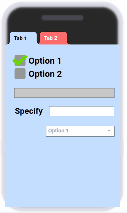
Choice Elements
What is it:
Choice elements allow you to curate or pre-populate a select number of values for the user to choose from.
What does it store in my RLD Database?
Text, specifically formatted and cased as you made them or pre-populated them.
Checkboxes
Checkboxes allow multiple choices to be selected.
All choices show up on the screen at once.
Radio
Radios only allow a single choice to be selected.
All choices show up on the screen at once.
Toggle
Toggle allows 1 of 2 options to be selected.
Both choices show up on screen an once.
Dropdown
Dropdown allows 1 choice to be selected at a time.
Only the selected choice or default text shows up on screen, a user must click on the drop down to show and scroll through the other options.
Dropdown Height
This attribute determines how many options are shown when a user clicks on the dropdown. All options can be scrolled through however the height of the dropdown is dependent on this attribute.
EX: If my drop down has 9 options and I choose my dropdown height to be 3, when I initially click I will only see the first 3 options, however I can scroll down to see the rest.
Defaults
All choices have the ability to have a default selected under the bucket on the right sidebar. Select one of the options or select "No Default".
Buttons
How they work
Buttons do 2 things:
- Gather the times it was clicked
- EX: if you clicked on the button 2 seconds after opening the form and 14 seconds after the opening the form, the button would store [2,14] in the database.
- This allows you to do calculations that help you determine how your users use your app, and the time between important events/clicks.
- Cause Things to Change on Screen
- This can include starting a timer, opening a popup, or even submitting the form.
- This allows you to make your forms dynamic, responding to user input and containing a lot more inputs than can be fit or effectively used on a single screen.
Buttons Times
Buttons store the times they were clicked.
- Specifically they store the exact time in milliseconds they were clicked independent from the opening of the form.
- They store the number of milliseconds since the Unix Epoch
- They store the number of milliseconds since January 1st, 1970.
- EX: [1704758752934, 1704758768346, 1704758774352, 1704758785593]
Button Extra Actions
Submit
- Any button with Submit checked will send the data on the input form to your RLD database.
- The defualt option for submit it Everything which means all the data on your form is submitted.
- Single Group submit is possible. If you set a group to a Record Group it can be the target of a submit button, and that button will only submit the data in that group and not inside any other record group. See Groups section below)
Reset
- Reset sets all the data on the form to it's default. After a submit it will look as if you had just opened the form the first time.
- When using Record Groups a reset will only reset the values of the record group that you are resetting. No values outside will be effected.
- Prevent Reset on a Group is possible by setting a group to Ignore Reset. See Groups section below.
Popup and Hide
Popup brings a given group to the top of the input from above all other elements.
Hide makes that group disappear entirely until it is popped-up again.
- My Group Pops up or hides the group that the button is in. This is useful for things like tabs and close buttons.
- Group Selection if you choose a specific group that group will popup or hide when the button is clicked.
Timers
A button can be set to start, stop, toggle, and reset a timer. Only one can be selected at a time
- Start
- Starts a timer. It does not start it from 0, but rather from whatever current value it shows.
- Stop
- Stops a timer. Does not reset the timer, but rather pauses it and displays the value it was stopped at.
- Toggle
- Toggle will start a timer if it is stopped, Stop a timer if it is running
- Reset
- Resets the value of the timer to it's original/default value.
Groups
How they Work
Groups are groups of elements. When an element is in a group and the group is moved the element is moved with it. If a group is shown it's elements are shown, if a group is hidden it's elements are hidden.
A group has a background color, an outline, and opacity.
A group can be inside another group. The inner group will moved with the parent group, moving all the elements inside the parent and inner group accordingly.
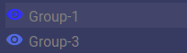
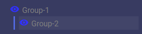
Inspect Groups
The group inspector shows you all the groups in your form as well as their hierarchy.
Tour
- A currently selected group is highlighted: (Group 1 is selected)
- A group inside another group:
- A group that is currently hidden/not showing on the editor:
- A group that is showing, but is not on top: (Group 3 is showing but Group 1 is on top)
- A group that is selected shows up on top
How to use it:
- To select a group (hidden or not) you can click on it's name in the group inspector
- To bring a group to the front so you can see it, you can click on it's name in the group inspector.
- To hide a group, click the group to select it, then click it again to hide it.
- To unhide a group, click on its name in the group inspector.
Put Group Inside a Group
- To put a group inside another group, click on the group you would like to move inside the other and begin dragging
- Now hold shift and drag the child group into the parent group
- The parent group should light up red when your cursor enters it
- Stop dragging
- If you look at the Group Inspector you will see the group you just dragged is not inside the other group.
Group Settings
Name
This name shows up in:
- The Group Inspector
- In the button extra actions popup list
- In the button extra actions submit/reset list (if the group is also a Record Group)
Ignore Reset
When a reset button is clicked (see Button Extra Actions) any group with ignore reset will not change. Any values entered will not be altered.
Hide Initially
Any group with hide initially checked will not show on the form until it is popped-up by a button (see Button Extra Actions)
Record Groups
A record group submits independently of other record groups. A button can be set to submit a specific record group, and when it does, only the data from that record group is submitted along with any data outside the group that is not in another record group. See Advanced Input Forms for more info.
In order to submit a record group you need either
- A button set to submit Everything
- A button set to submit the specific group
Record Groups and Submit Everything
- When a button has Submit Everything (see Button Extra Actions) it individually submits each record group on the form as 1 record.
Record Groups and Reset
- If a button is set to reset a record group it will only reset the things in that record group and nothing else.
- If a button is set to reset everything is will reset each record group as well as the other elements on the form.
Popups
Popups can be made, like the one below, using groups!
How to make a popup
- Drag a group into your layout
- Name the group "Popup 1" (any name will suffice)
- Under make the fill blue and opacity 100% (any color will do)
- Under select Hide Initially
- Drag a button into the layout, outside of the group
- Under Check Popup and Hide, and where it says "Everything" click and select "Popup 1" (your group name)
- Go to preview and click your button
Tabs
Create tabs like you see on your web browser using groups!
How to make tabs
- Drag a group onto your layout, make sure it covers the bottom 3/4ths of the screen
- Name the group "tab 1" (any name will suffice)
- Under make the fill blue and opacity 100% (any color will do)
- Drag a Group Tab button onto the group such that the bottom of it is inside the group and the top is outside.
- Select the tab button and under check popup and select "My Group" underneath.
- Drag in another group that is the same size, and covering the other group
- Name the group "tab 2" (any name will suffice)
- Under make the fill red and opacity 100% (any color will do)
- Drag a Group Tab button onto the group such that the bottom of it is inside the group and the top is outside.
- Select the tab button and under check popup and select "My Group" underneath.
- Preview your input form and click each tab button to pop up the corresponding tab
Repeat steps 6-10 for each extra tab you would like to add
Pages
Pages are similar to popups and can be easily created using groups!
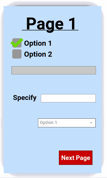
How to make Pages
- Drag a group onto your layout, make sure it covers the whole screen
- Name the group "page 1" (any name will suffice)
- Under make the fill blue and opacity 100% (any color will do)
- Drag a Button onto the group near the bottom right corner
- Under change the button to say "Next Page"
- We will come back to this button at a later step
- Drag in another group that is the same size, covering the other group
- Name the group "page 2" (any name will suffice)
- Under make the fill red and opacity 100% (any color will do)
- Drag a Button onto the new group near the bottom left corner
- Select the button and under change the button to say "Last Page"
- Select the button and under check popup and select "page 1" underneath.
- Go to and click on "page 1" (your first group name)
- Select the button on this group
- Under check popup and select "page 2" underneath.
- Preview your input form and click the next and last page buttons to flip between pages.
Repeat steps 7-12 for each extra page you would like to add. Adding next and last buttons as you need them

 Wiki
Wiki