If you'd like to know more about graphs, check out the RLD wiki page on graphs
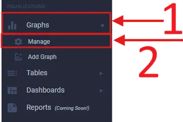
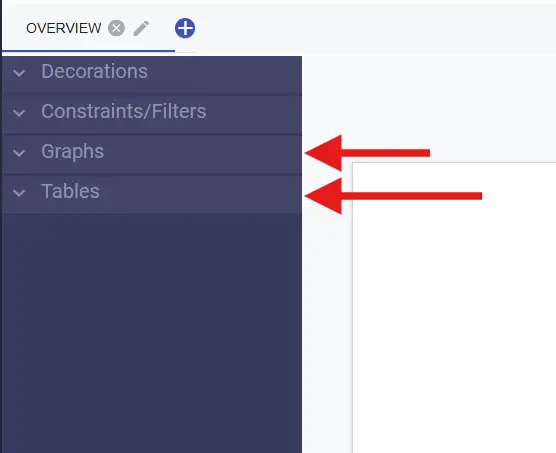
First get to the Graph Manage screen by clicking on Graphs
and Manage on the left sidebar under Visualizations
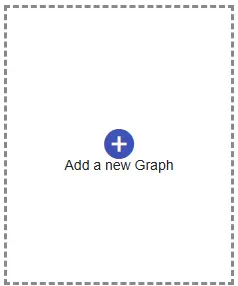
Once you're there click the Add a new Graph button, this will
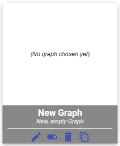
create a new graph tile. Click on this new graph tile to get started.
![]()
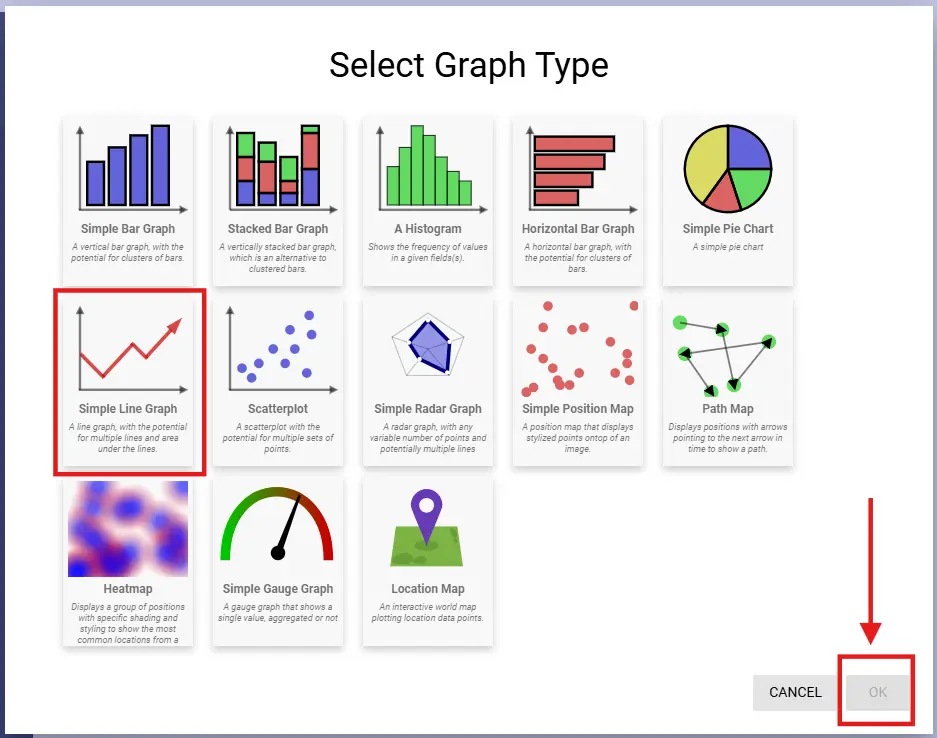
Now select the type of graph you want to create, in this case Line Graph
Follow the gif below to see how to configure our graph
If you'd like to know more about graphs, check out the RLD wiki page on graphs
If you'd like to know more about tables, check out the RLD wiki page on tables
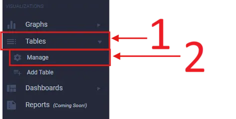
Just like with graphs, we first need to get to the Table Manage screen
by clicking on Tables and Manage on the left sidebar under Visualizations
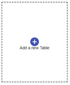
Once you're there click the Add a new Table button, this will
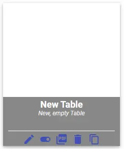
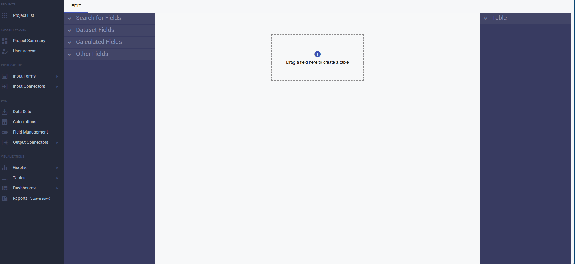
create a new table tile. Click on this new table tile to get started.
![]()
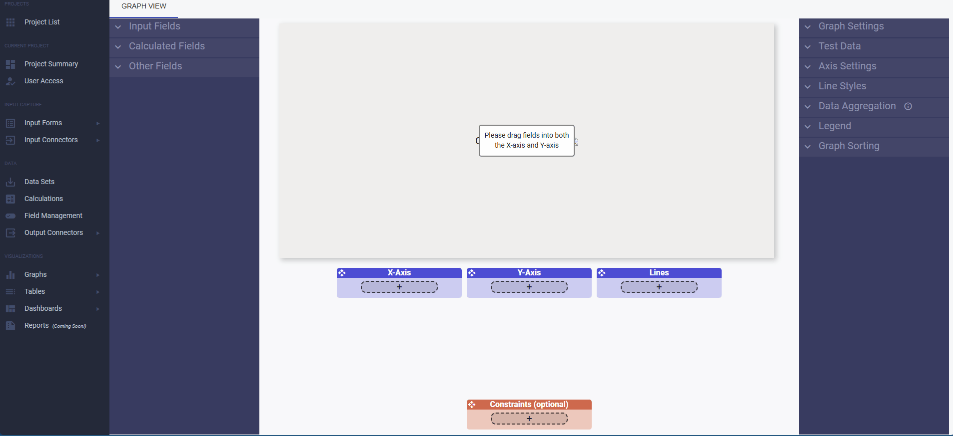
Now you should be at a screen that looks like the picture below. In order to create
our table, we will be dragging fields from the left buckets into the box in the middle.
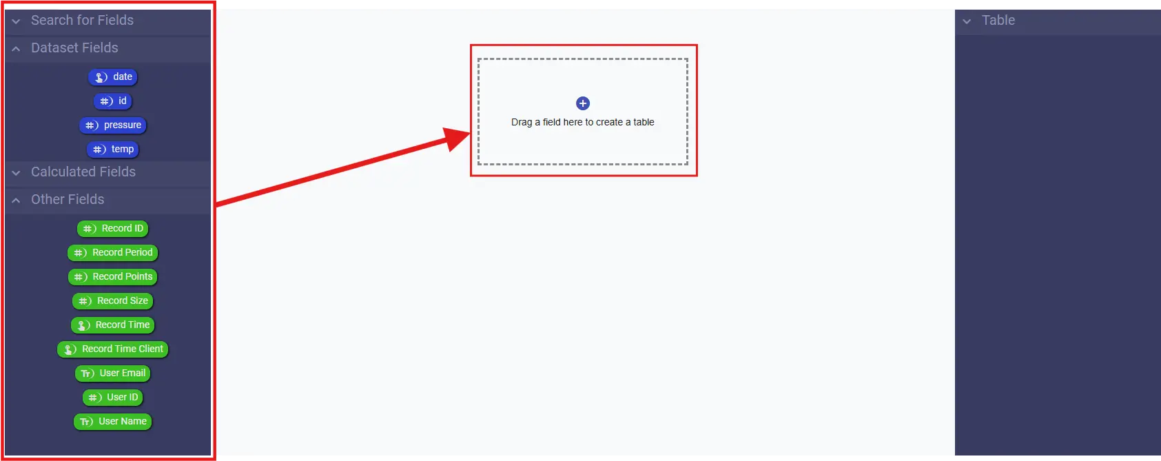
The gif belows shows what the process of adding fields should look like.
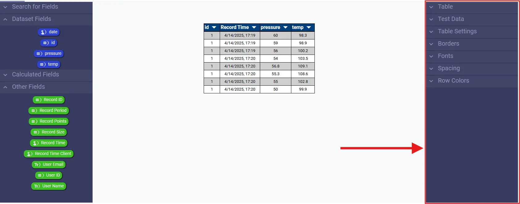
The image below shows the configuration sidebar, where all of our configuration options are.
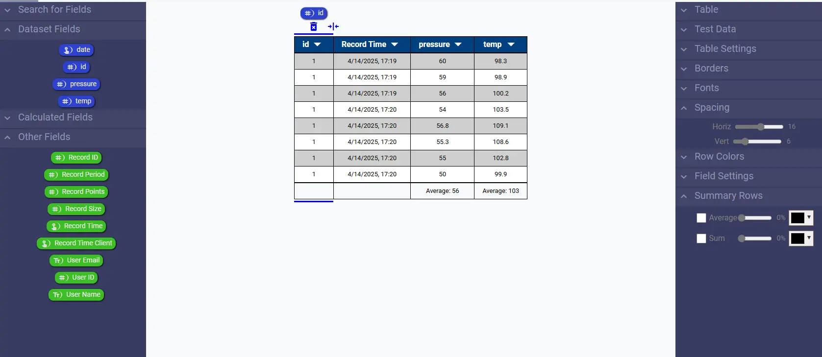
On the configuration sidebar click Spacing and increase the vertical and horizontal spacing slightly
Next click on the "pressure" column on the table,
then on the configuration sidebar you should see a new bucket called Summary Rows.
Click Summary Rows then check the box for Average. Then do this same thing for
the "temp" column. It should look something like this:
If you'd like to know more about tables, check out the RLD wiki page on tables
If you'd like to know more about dashboards, check out the RLD wiki page on Dashboards
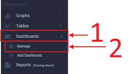
First get to the Dashboard Manage screen by clicking on Dashboards
and Manage on the left sidebar under Visualizations
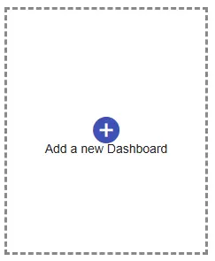
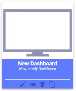
Once you're there click the Add a new Dashboard button, this will
create a new dashboard tile. Click on this new dashboard tile to get started.
![]()
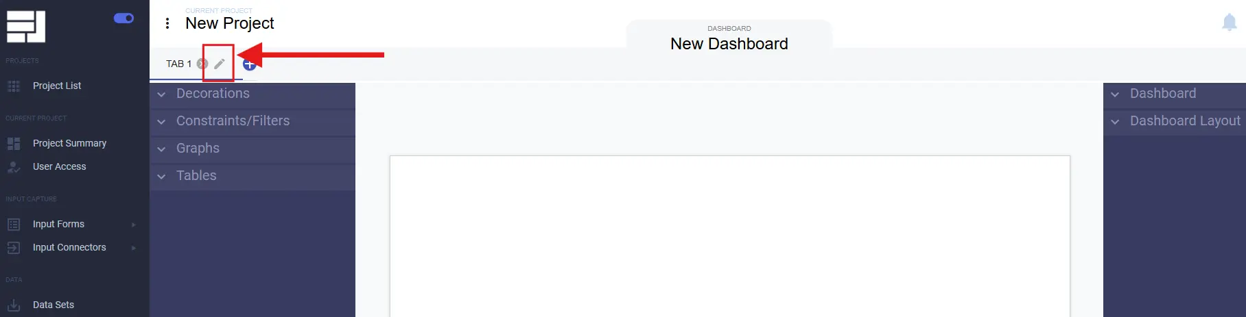
When you create a dashboard it is organized by tabs that can be seen at the top of
the screen. Lets go ahead and rename the default tab. Click the edit icon
next to the tab title and rename it to something more useful like "Overview".
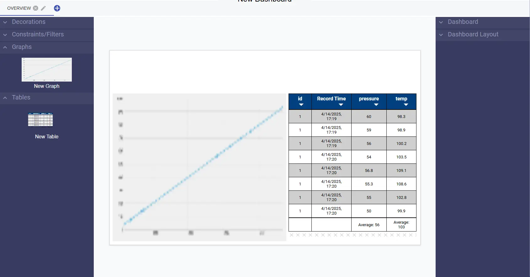
On the left we will find all of our elements that we can drag into our dashboard:
First lets open up the Graphs and Tables buckets and drag in our table and graph that we made above.
For this example I have placed and sized them as follows:
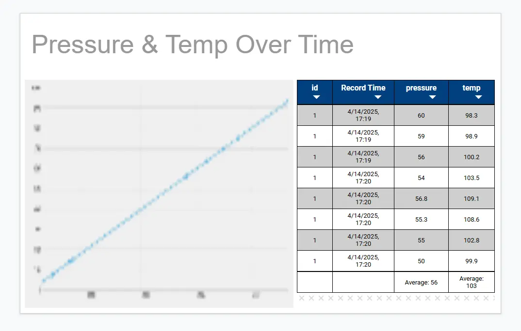
Next lets add some text at the top of the page to contextualize the graph and table.
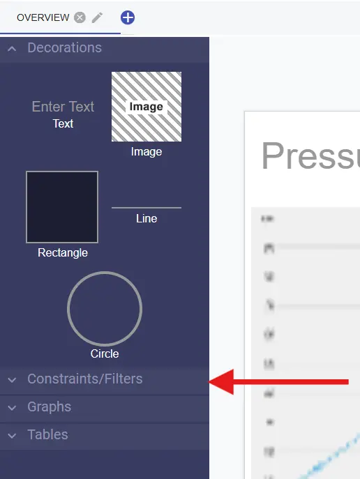
Click Decorations bucket and click and drag in some text. On the right sidebar
a new bucket will become visible called Words and Labels, open this bucket and
type in some text that helps explain what this graph and table represent. For example:
"Pressure & Temp Over Time". It should look like this:
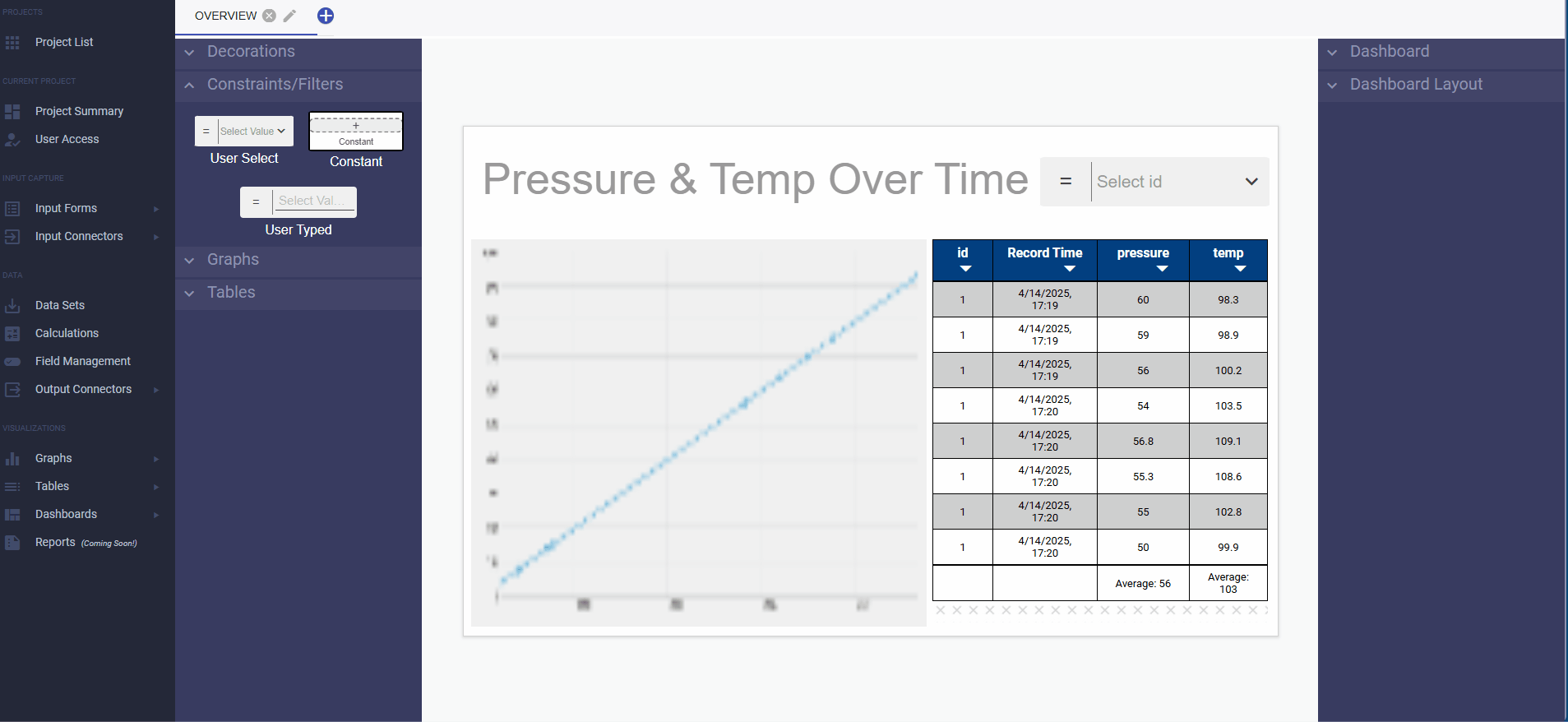
Now we are going to add a constraint to the graph that users are quickly
and easily able to change from a drop down menu. To start, click the constraints
bucket and click and drag in a User Select
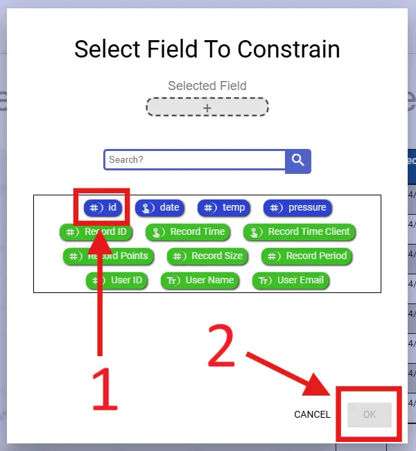
Once you're dragged it in you will need to select what field it constrains.
For this example we will be constraining on id so we can easily see the
data for individual machine ids.
Next we need to connect it to the graphs and tables that we would like the constraint to modify. The gif below guides you through this process:
The following is a video compiling all the steps above
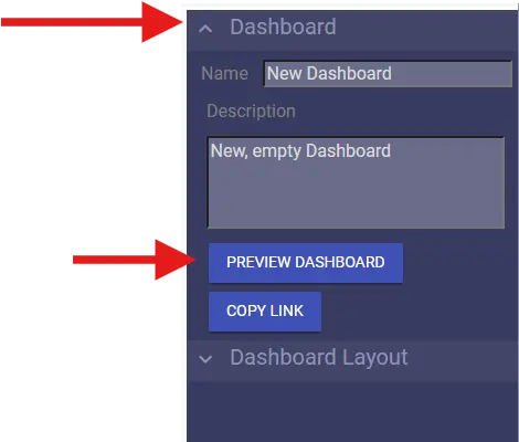
Find the PREVIEW DASHBOARD button under the Dashboard configuration bucket on the left side
Login with your same account credentials
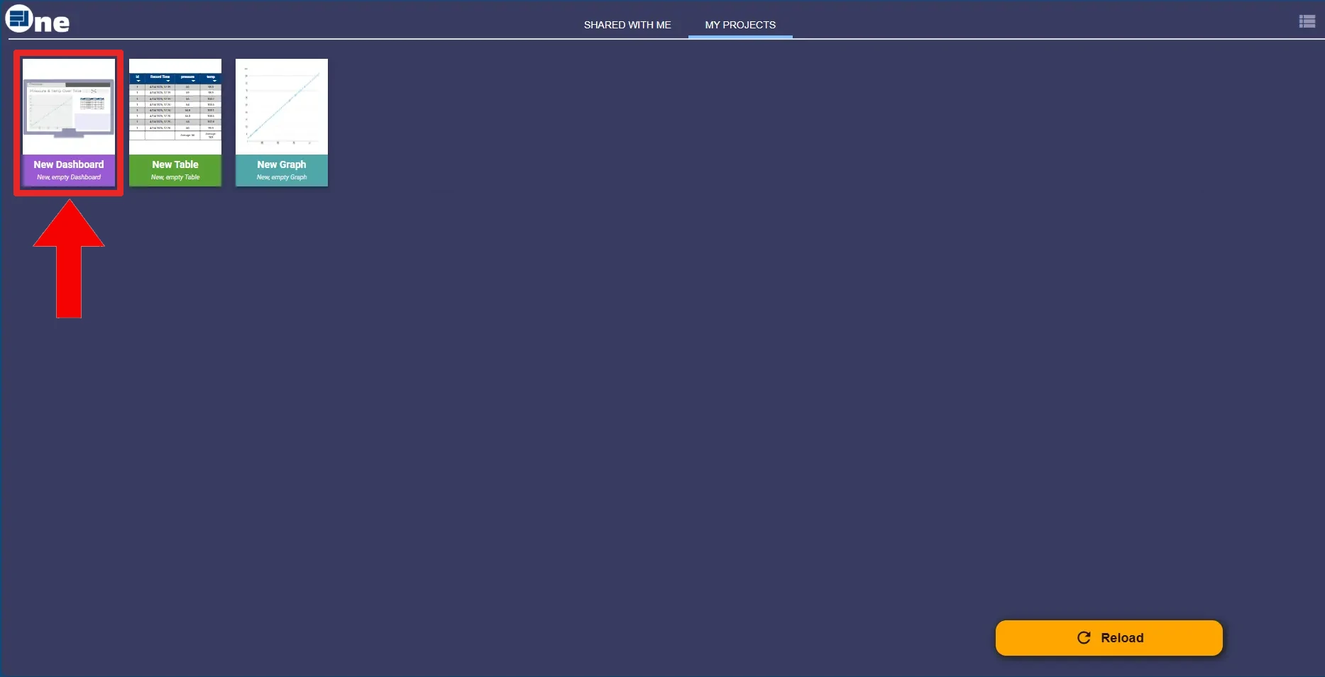
You should be taken to a page that looks like this. Click the purple tile
with the name of the dashboard we just made: "New Dashboard".
If you'd like to know more about dashboards, check out the RLD wiki page on Dashboards
 Wiki
Wiki